Genome Visualization
Background
A research client approached me with a specific request: “Recreate this comparative genome figure from our raw Fasta and GenBank (.gbk) files.” The reference image showed multiple genome tracks with gene arrows and synteny ribbons connecting homologous regions. I had experience with data visualization, but genome visualization, working with .gbk, annotations, and synteny was a new territory.
I came in as a beginner to genome visualization. To bridge the gap, I studied annotation standards and file formats, experimented with multiple alignment outputs, and tuned figure layouts (tracks, arrows, ribbons, labels, and scale bars) to reach a clean, client-ready result. It broadened my horizon and revealed real demand for specialized, reproducible genomics visuals.
Note: Any images used during development were client-provided references for layout parity and are not the project output.
The Problems
- Transform raw FASTA / GenBank (.gbk) into a publication-quality comparative genome figure
- Extract correct genomic features (CDS, tRNA, rRNA) and their orientations for gene arrows
- Compute reliable synteny blocks from alignment outputs and connect homologous regions cleanly
- Match the client’s target style (track spacing, arrow design, colors, ribbon opacity, labels, and scale bars)
- Keep the workflow reproducible, modular, and extendable to new genomes
Our Approach
I built an end-to-end pipeline that goes from raw assemblies and GenBank files to a client-ready comparative genome figure. When only FASTA was available, I performed structural and functional annotation first, then generated synteny blocks via alignments, parsed features and coordinates programmatically, and rendered the final plot with a consistent styling system.
End-to-end workflow
- Receive data
- Quality checks
- Structural & functional annotation (if only FASTA is provided)
- Similarity search and reference curation
- Pairwise/multi-genome alignment for synteny
- Parsing and integration
- Visualization
Architecture
Input Data
- FASTA (genome assemblies)
- GenBank (.gbk) (annotations)

Pipeline
1) Quality checks
2) (Optional) Annotation: Prokka
3) Similarity search / alignments: BLAST+ / MUMmer
4) Parsing & integration: Biopython
5) Visualization: pyGenomeViz

Outputs
- High-resolution figures (PNG / SVG / PDF)
- Summary tables (gene counts, genome sizes, alignment coverage)
The workflow was designed to be reproducible and modular: each stage can be rerun independently, parameters are centralized, and adding a new genome only requires adding the input files and updating the configuration.
Project Showcase
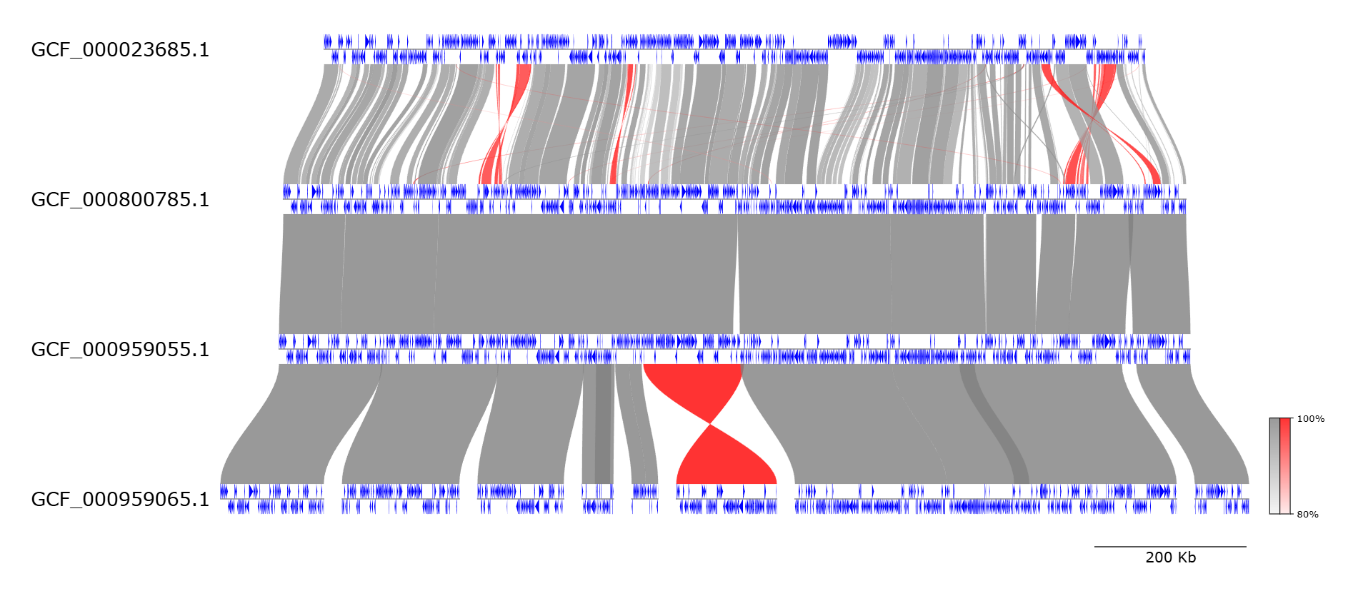
Swipe to preview multi-genome tracks, gene arrows, synteny ribbons, and export-ready layouts.
Methodology & Key Features
- Input: Raw genome assemblies (FASTA) and GenBank (.gbk) files
- Goal: Publication-quality comparative plot replicating the client’s layout and labeling style
- Constraints: Reproducible, modular, and easy to extend to new genomes
- Annotation: Prokka (when only FASTA was provided)
- Alignments: BLAST+ / MUMmer for similarity search and synteny blocks
- Parsing: Biopython for features, coordinates, and metadata extraction
- Visualization: pyGenomeViz for multi-track genome plots with synteny ribbons
- Export: High-resolution PNG/SVG/PDF for publication and reporting
Challenges
- Domain onboarding: Understanding FASTA/GBK/GFF formats, feature types (CDS, tRNA, rRNA), and annotation conventions.
- Toolchain choice: Selecting a pipeline that could go from raw assemblies to annotated, plottable genomes and robust synteny blocks.
- Visual parity: Matching track spacing, gene arrow styling, colors, ribbon opacity, labels, and scale bars while keeping the code reusable.
Results
I delivered a client-ready, publication-quality comparative genome figure that matched the target layout and labeling style, supported by a reproducible and modular workflow. The output figures were exportable in high-resolution formats for research reporting and publication use.
Deliverables
- High-resolution figures (PNG / SVG / PDF)
- Summary tables (gene counts, genome sizes, alignment coverage)
- Reusable end-to-end pipeline ready to extend to additional genomes
Impact
This project broadened my horizon beyond “generic” data visualization into a niche with real demand: genome and comparative genomics visualization. I now see opportunities to support research teams, biotech startups, and labs that need publication-quality figures or automated pipelines for genomic data.
- Turned complex genomic data into clear, interpretable visuals
- Enabled reproducible figure generation with consistent styling
- Created a modular workflow that scales to new genomes with minimal effort
- Established a foundation for future genomics visualization services and pipelines